Design Android 16 gets major overhaul: this is what it looks like
Google would like to polish the look of Android 16 considerably. In fact, it would be the biggest change since 2012's Android 5 Lollipop when Google applied the first version of Material Design. We show you the first images in advance.
Google's house style for Android, and much other software, is called Material You. It is a further development of Material Design that was introduced in 2012 along with Android 5 and dictates how buttons look, what font is used and more such things. This makes everything look sleek and recognizable.
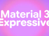
Material Design received several major updates over the years with the last one in 2021 where it all became a bit more personal. Google thinks the time is right for another version and we're going to see that starting on Android 16. Material 3 Expressive will be demonstrated during Google I/O next month but Android Authority managed to get hold of the first screenshots already.
More color, blurry backgrounds
From these, it becomes clear that Android 16 will have more color with backgrounds that are provided with a strong blur. This makes it somewhat like looking through frosted glass. Maybe it's a coincidence, but rumors are circulating that Apple wants to give its iOS 19 a similar design as well.

The design of some buttons also gets a makeover. For example, the volume and brightness slider get a new look. A new font also appears to have been used. Furthermore, the source reports renewed icons in the status bar, including those for battery and network strength.
More during Google I/O
Users will be able to adjust the size of app icons and the settings menu will get more color. Notifications on the lockscreen can be collapsed to make it less cluttered. These are just a few of the many changes Google has in store for us. We expect to see most of them up close May 20 when Google holds its annual Google I/O.