Phonebook
There are separate icons for calling and contact overview but they both go to the same app. That's how we like it. At the top there are several tabs for calls, contacts, favorites and groups. You can change this layout yourself and leave out favorites and groups. You can also switch between tabs by swiping across the screen. Just like Google intended for Android.


".
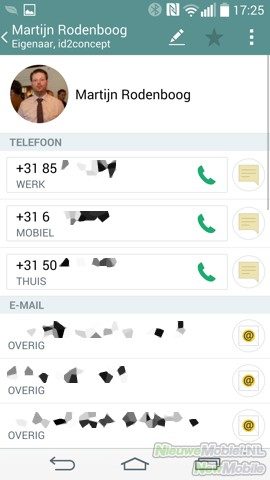
Different accounts are neatly merged and displayed in the address book. There's nothing to complain about at all. You can even display the address book as a QSlide widget. We're not really fans of it, but you can easily minimize it to the right side. They then change into a single icon that opens as soon as you click on it. That will come in handy again.
Messaging
Where the bubbles and contacts app is green, the texting app is sandy. This way, if you're not colour-blind, you can see at a glance which app you have in front of you. The app for texting is further as we are used to it; fine. So we're not going to dirty any more words about it. The keyboard, on the other hand, is more worth discussing.
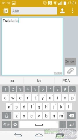


".
The five-row counting keyboard is highly customizable. For example, you can arrange the bottom row of buttons, you can remove the numeric part at the top, you can choose from a black and white theme and you can even select the height of the keyboard. Big for big fingers, small for small hands. There's also auto-correction, word suggestion, and path input that lets you enter words by swipe from letter to letter. To our surprise, the latter also works quite reasonably well. Unfortunately, this so-called path input does not work everywhere, as in some 3rd party apps.


".
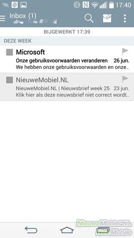
In addition to an excellent keyboard, SMS application and the Gmail app, there is also an email client of its own. The settings of most accounts are entered automatically and you can choose from different types of synchronization. This app is also well taken care of.