Display
The screen of the Classic measures diagonally 3.5 inches and is an exact square with a resolution of 720 x 720 pixels. The technique used is Super AMOLED and all in all this results in a sufficiently detailed and pleasantly usable image. The screen can be activated by swiping from bottom to top.


Clearly, the screen is not really spacious. Especially when you're used to a Full touch phone with a 5 inch or bigger screen, you sometimes feel like you're running out of space. This can be slightly improved by reducing the font size. There is no automatic mode for the screen brightness. Besides font size and brightness, the white balance of the screen can also be adjusted. This is not really necessary and the image soon becomes too blue or too yellow.
Menu
BlackBerry OS 10 had some teething problems in the beginning, but in version 10.3.1 they should be out for the Classic. In a way, the user has five start screens at his disposal. These are visualized with five icons at the bottom of the screen. On the far left is the BlackBerry Hub, which will be discussed in more detail in the messaging section of this review. To the right of the Hub is the primary home screen. This is basically a multi-task screen with up to eight thumbnails of active apps. Another step to the right starts the application menu with 15 icons per page.


Opened applications can be reduced to the multi-task screen by swiping upwards from below the screen. It may happen that you accidentally touch the optical trackpad but generally the app shrinks neatly.
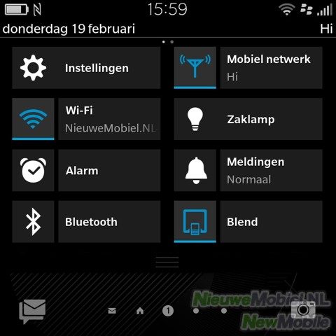

By swiping the screen from top to bottom, the quick settings window appears. Up to 16 shortcuts to settings can be displayed on three tabs. Unfortunately, this window is only available from the home screen and not elsewhere in the interface.

On the lock screen notifications of all kinds of messaging services and applications are neatly grouped by type. Pressing the icon of an app opens previews of the messages and after tapping again you can open the relevant app. In the interface, a line for touch-input buttons is often visible at the bottom of an image. This takes up quite a bit of screen space, which is a pity because the presence of physical control buttons directly below the screen means that this line is not really necessary. So you could say that OS 10.3.1 is not completely optimally tuned to the Classic.

Although the interface of OS 10 can now be called mature, there is also a generation difference compared to iOS and Android. The whole thing looks a bit boring or outdated and occasionally we came across some strange or inadequate translations.
Opening applications goes smoothly but not exactly smoothly. After tapping an icon, the image first jumps back to the home screen with the thumbnails before the app is actually opened.